Users watch videos with subtitles for countless reasons — from those who are hard of hearing, scrolling without sound, or watching content in another language. Seeing an on-screen transcript makes all kinds of content more accessible.
But subtitles and captions are only functional when they’re easy to read. If you use a color that’s the same as your background or you choose a complicated cursive typeface, viewers can’t understand what’s going on. The secret is using a readable font that stands out without creating a distraction.
Use this guide to subtitle fonts and start improving video accessibility for your entire audience.
4 Things To Consider When Choosing a Subtitle Font
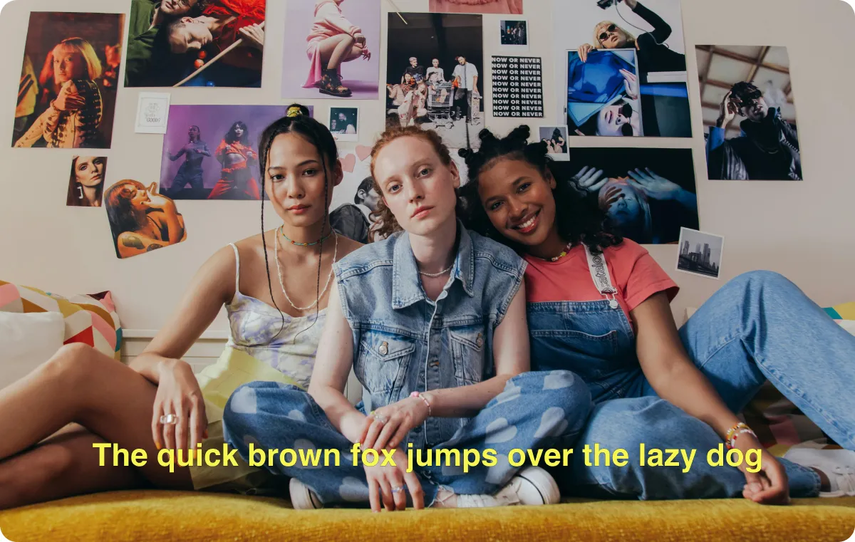
If you’ve ever viewed a foreign film or watched sports in a loud place, you’re probably already familiar with subtitling — and you may have observed a few things about the text. It’s often in a bright color, like yellow, and has a large letter size. Those characteristics are there for a reason: they add contrast to make captions much easier to read.
When you’re adding subtitles to your videos, choose a typeface that stands out from the background so your viewers can read them clearly. Here are a few tips:
- Avoid distracting text: While captions and subtitles are great for those who need or want them, they shouldn’t distract from the video. Your text should be clear, clean, and an appropriate size so it shows up without taking away from the video’s point or covering important visuals.
- Prioritize readability: Intricate typefaces might look nice, but they’re tough to read. If you have trouble deciphering a font, your viewer will, too, which can take away from their experience watching your video. Swap it out for one you can immediately understand.
- Choose a font that fits your video's theme: The best fonts for videos match the existing tone. If you’re creating loud, high-energy videos, a bold, colorful font can work. On the other hand, a documentary-style video about a serious topic might need something more understated and simple.
- Use shadows or outlines for better visibility: If you add white text to a background that’s constantly changing, there’s a chance some words could get lost in lighter colors. Adding shadows and outlines — which contain every letter with a darker tone — help text stand out on backgrounds of any color.
The 5 Best Fonts for Subtitles and Captions
Choosing a font for your captions doesn’t have to be difficult. The Captions app has over 20 options ranging from simple and sleek to playful and fun — and they’re all readable and easy to use.
It’s important to note that typography is the actual type of font you use, like Calibri or Times New Roman, and the typeface describes the cumulative elements of text you use. That means a size 12, bolded Times New Roman is one typeface, and a size 14, italicized Times New Roman is another. Consider every element, including the font and format, to pick the most appealing and readable option for your captions.
Here are five of our top picks:
1. Helvetica
Helvetica is a classic sans-serif font, meaning it has no curls or projections at the ends of the letters. That makes it easier to read for many users, especially those viewing on low-resolution screens. It’s especially clean-looking, and the letters are easy to distinguish and understand. Helvetica is an excellent starting point if you want a simple but effective font.

2. Roboto
Roboto is another simple, sans-serif typeface that won’t distract from what’s going on in your video. This font is more rounded than other popular options, like Helvetica, giving it a more contemporary feel.

3. Avenir
Avenir is a modern-looking, sans-serif font with squat, neat letters. It boosts the aesthetic quality of a video without becoming distracting, making it a solid option if you're prioritizing both readability and looks.
4. Fredoka One
Fredoka One is a sans-serif typeface with a playful vibe that looks like you’ve written it with a marker, but neater. It’s great for when you want to use a more unique font while maintaining a simple look.
5. Lobster
Lobster has thick italic cursive letters that really stand out to the viewer. This bold typeface mimics lettering on old-school baseball caps or the side of diners, so it gives a vintage feel as well. It looks best on videos that don’t contain much text, though, so it doesn’t become distracting.
3 Tips for Effective Captions and Subtitles
Once you’ve found the best font for your captions, you’ll need to make a few more decisions about colors, consistency, and sizing. Here’s how to create captions that get the job done while looking good:
- Choose font colors that contrast with your video background — If your video takes place outside with a bright blue sky, bright blue captions will fade into the background and viewers won’t be able to read them. Instead, choose a color that contrasts with the general tones of your video. Black or white are usually the best options, and they’re even better if you use shadows or outlines for more visibility.
- Maintain a consistent font throughout the video — With so many great-looking font options, it can be challenging to choose just one. However, it’s best to settle on a single, consistent font for the whole video to avoid distractions, unless you want to switch fonts to emphasize certain words.
- Choose the right size and placement — Captions should be big enough to read but small enough that they don’t cover any important elements of the video. You should also think about the placement. Though the bottom of the screen is common for captions, it might vary from case to case, especially if the video’s subject moves around.
How To Choose a Font in the Captions App
Captions has everything you need to create subtitles with the perfect balance of readability and aesthetic — and the best part is you don’t have to manually transcribe the text. Here’s how to add captions and adjust your settings for the right look:
- Open the Captions app.
- Tap the purple “Create” button at the bottom of the screen.
- Import a video or record one in the app.
- Select your language, then tap “Proceed.”
- Wait for Captions AI to automatically transcribe your voice.
- Use the bottom bar to customize the font. At this stage, you can also adjust the size and colors of your captions.
- If you want to, you can edit individual words to supersize them, which makes them bigger, or emphasize them, which adjusts their color to be brighter and more noticeable.
- Once you’re done, export to your camera roll to upload anywhere.
Subtitle Your Videos With Captions
People who are hard of hearing, prefer to scroll without sound, or just like to see what you’re saying deserve better access to understand — and enjoy — your content.
Putting manual text on a video can be hard work, so let Captions do it for you. Captions automatically captions videos in a variety of languages and has a library of easy-to-read and aesthetically pleasing fonts to choose from. Put your own spin on Captions’ typefaces by selecting the color, size, and effects while cutting down your editing time.


